2.7 Fitting Linear Models to Data
4.3 Fitting Linear Models to Data
Learning Objectives
In this section, you will:
- Draw and interpret scatter diagrams.
- Use a graphing utility to find the line of best fit.
- Distinguish between linear and nonlinear relations.
- Fit a regression line to a set of data and use the linear model to make predictions.
A professor is attempting to identify trends among final exam scores. His class has a mixture of students, so he wonders if there is any relationship between age and final exam scores. One way for him to analyze the scores is by creating a diagram that relates the age of each student to the exam score received. In this section, we will examine one such diagram known as a scatter plot.
Drawing and Interpreting Scatter Plots
A scatter plot is a graph of plotted points that may show a relationship between two sets of data. If the relationship is from a linear model, or a model that is nearly linear, the professor can draw conclusions using his knowledge of linear functions. Figure 1 shows a sample scatter plot.
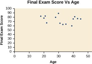
Notice this scatter plot does not indicate a linear relationship. The points do not appear to follow a trend. In other words, there does not appear to be a relationship between the age of the student and the score on the final exam.
Example 1
Using a Scatter Plot to Investigate Cricket Chirps
The table below shows the number of cricket chirps in 15 seconds, for several different air temperatures, in degrees Fahrenheit (Selected data from http://classic.globe.gov/fsl/scientistsblog/2007/10/. Retrieved Aug 3, 2010). Plot this data, and determine whether the data appears to be linearly related.
| Chirps | 44 | 35 | 20.4 | 33 | 31 | 35 | 18.5 | 37 | 26 |
| Temperature | 80.5 | 70.5 | 57 | 66 | 68 | 72 | 52 | 73.5 | 53 |
Table 1 Cricket Chirps vs Air Temperature
Solution
Plotting this data, as depicted in Figure 2 suggests that there may be a trend. We can see from the trend in the data that the number of chirps increases as the temperature increases. The trend appears to be roughly linear, though certainly not perfectly so.
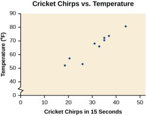
Figure 2: Scatterplot of Number of Chirps Vs Temperature
Finding the Line of Best Fit
Once we recognize a need for a linear function to model that data, the natural follow-up question is “what is that linear function?” One way to approximate our linear function is to sketch the line that seems to best fit the data. Then we can extend the line until we can verify the y-intercept. We can approximate the slope of the line by extending it until we can estimate the ![]()
Example 2
Finding a Line of Best Fit
Find a linear function that fits the data in Table 1 by “eyeballing” a line that seems to fit.
Solution
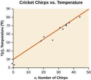
On a graph, we could try sketching a line. Using the starting and ending points of our hand drawn line, points (0, 30) and (50, 90), this graph has a slope of:
![]()
![]()
and a y-intercept at 30. This gives an equation of
![]()
where c is the number of chirps in 15 seconds, and T(c) is the temperature in degrees Fahrenheit. The resulting equation is represented in Figure 3.
Analysis
This linear equation can then be used to approximate answers to various questions we might ask about the trend.
Recognizing Interpolation or Extrapolation
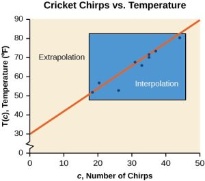
While the data for most examples does not fall perfectly on the line, the equation is our best guess as to how the relationship will behave outside of the values for which we have data. We use a process known as interpolation when we predict a value inside the domain and range of the data. The process of extrapolation is used when we predict a value outside the domain and range of the data.
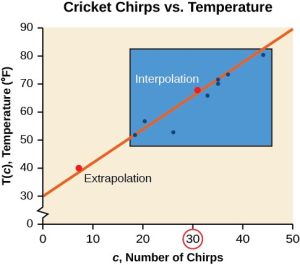
Figure 4 compares the two processes for the cricket-chirp data addressed in Example 2. We can see that interpolation would occur if we used our model to predict temperature when the values for chirps are between 18.5 and 44. Extrapolation would occur if we used our model to predict temperature when the values for chirps are less than 18.5 or greater than 44.
There is a difference between making predictions inside the domain and range of values for which we have data and outside that domain and range. Predicting a value outside of the domain and range has its limitations. When our model no longer applies after a certain point, it is sometimes called model breakdown. For example, predicting a cost function for a period of two years may involve examining the data where the input is the time in years and the output is the cost. But if we try to extrapolate a cost when that is in 50 years, the model would not apply because we could not account for factors fifty years in the future.
Interpolation and Extrapolation
Different methods of making predictions are used to analyze data.
The method of interpolation involves predicting a value inside the domain and/or range of the data.
The method of extrapolation involves predicting a value outside the domain and/or range of the data.
Model breakdown occurs at the point when the model no longer applies.
Example 3
Understanding Interpolation and Extrapolation
Use the cricket data from Table 1 to answer the following questions:
- Would predicting the temperature when crickets are chirping 30 times in 15 seconds be interpolation or extrapolation? Make the prediction, and discuss whether it is reasonable.
- Would predicting the number of chirps crickets will make at 40 degrees be interpolation or extrapolation? Make the prediction, and discuss whether it is reasonable.
Solution
- The number of chirps in the data provided varied from 18.5 to 44. A prediction at 30 chirps per 15 seconds is inside the domain of our data, so would be interpolation. Using our model:
![]() degrees
degrees
Based on the data we have, this value seems reasonable.
- The temperature values varied from 52 to 80.5. Predicting the number of chirps at 40 degrees is extrapolation because 40 is outside the range of our data. Using our model:
![]()
![]()
![]()
We can compare the regions of interpolation and extrapolation using Figure 5.
Analysis
Our model predicts the crickets would chirp 8.33 times in 15 seconds. While this might be possible, we have no reason to believe our model is valid outside the domain and range. In fact, generally crickets stop chirping altogether below around 50 degrees.
Try It Now 1
Finding the Line of Best Fit Using a Graphing Utility
While eyeballing a line works reasonably well, there are statistical techniques for fitting a line to data that minimize the differences between the line and data values. One such technique is called least squares regression and can be computed by many graphing calculators, spreadsheet software, statistical software, and many web-based calculators. Least squares regression is one means to determine the line that best fits the data, and here we will refer to this method as linear regression.
How to do Linear Regression Using Technology
- Using a TI – 83/84 Type Calculator
- Enter the x-values in List 1 (L1) accessible through STAT-
EDIT - Enter the y-values in List 2 (L2) accessible through STAT-EDIT
- Click STAT – CALC – LinReg (L1, L2)
- Enter the x-values in List 1 (L1) accessible through STAT-
- Using Desmos
- Click + in the upper left hand corner and choose Table
- Fill in your x and y-values
- Click the
 regression symbol to the left of your table.
Technically, the method minimizes the sum of the squared differences in the vertical direction between the line and the data values.
Example 4
Find the least squares regression line using the cricket chirp data from Table 1.
Solution with Desmos
- Click the + and the Table button as seen in Figure 6.
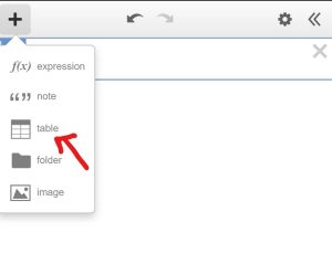
Figure 6: Demonstrating the location of the table input button in Desmos. - Enter the chirps in the
 column and the temperatures in the
  column as in Figure 7.
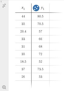
Figure 7: Values entered into the Desmos Table
- Select Linear Regression by clicking the
 button. Using the cricket chirp data from earlier, with technology we obtain the equation:
![]()
which means for our function:
![]()
Notice we also obtained an ![]() value of 0.9043 and r = 0.9509. These are diagnostic values to tell us whether or not our model is good.
value of 0.9043 and r = 0.9509. These are diagnostic values to tell us whether or not our model is good.
In Desmos, we can also see the scatterplot with the regression line drawn. Although we may have to adjust the window settings to see it properly. See Figure 8.
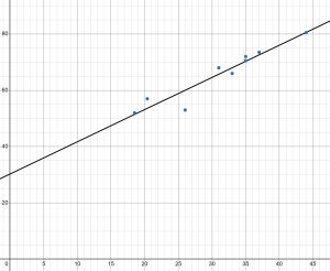
Analysis
Notice that this line is quite similar to the equation we “eyeballed” but should fit the data better. Notice also that using this equation would change our prediction for the temperature when hearing 30 chirps in 15 seconds from 66 degrees to:
Q&A
Will there ever be a case where two different lines will serve as the best fit for the data?
No. There is only one best fit line.
Distinguishing Between Linear and Nonlinear Models
As we saw above with the cricket-chirp model, some data exhibit strong linear trends, but other data, like the final exam scores plotted by age, are clearly nonlinear. Most calculators and computer software can also provide us with the correlation coefficient, which is a measure of how closely the line fits the data. Many graphing calculators require the user to turn a “diagnostic on” selection to find the correlation coefficient, which mathematicians label as ![]() . The correlation coefficient provides an easy way to get an idea of how close to a line the data falls.
. The correlation coefficient provides an easy way to get an idea of how close to a line the data falls.
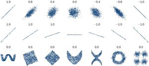
We should compute the correlation coefficient only for data that follows a linear pattern or to determine the degree to which a data set is linear. If the data exhibits a nonlinear pattern, the correlation coefficient for a linear regression is meaningless. To get a sense for the relationship between the value of and the graph of the data, Figure 9 shows some large data sets with their correlation coefficients. Remember, for all plots, the horizontal axis shows the input and the vertical axis shows the output.
Correlation Coefficient
The correlation coefficient is a value, between –1 and 1.
- suggests a positive (increasing) relationship
- suggests a negative (decreasing) relationship
- The closer the value is to 0, the more scattered the data.
- The closer the value is to 1 or –1, the less scattered the data is.
Coefficient of Determination
For our cricket-chirp data, the ![]() of .9043 means that 90.43% in the variation in temperature can be reduced by knowing how often the crickets are chirping. Note that there is some variation in temperature still, but this tells us that we can be pretty accurate guessing the temperature if we count the cricket chirps in 20 seconds.
of .9043 means that 90.43% in the variation in temperature can be reduced by knowing how often the crickets are chirping. Note that there is some variation in temperature still, but this tells us that we can be pretty accurate guessing the temperature if we count the cricket chirps in 20 seconds.
The correlation coefficient of 0.9509 for the cricket-chirp data is very close to 1, which suggests a strong, increasing linear relationship.
Note: For some calculators, the Diagnostics must be turned “on” in order to get the correlation coefficient and coefficient of determination when linear regression is performed: [2nd]>[0]>[alpha][x–1], then scroll to DIAGNOSTICSON.
Interpretation of Slope
The interpretation of the slope of a regression line is very similar to that of an linear function. However, the regression line is an estimate of the average y value for each possible x.
So for each one unit increase in the x-value, our y-value will increase (or decrease if the slope is negative) by ![]() units (y-units) on average.
units (y-units) on average.
For our cricket-chirp data, we might say that for each each one addition cricket chirp in a 20 second interval, the temperature will be higher by 1.14318 degrees on average.
Fitting a Regression Line to a Set of Data
Once we determine that a set of data is linear using the correlation coefficient, we can use the regression line to make predictions. As we learned above, a regression line is a line that is closest to the data in the scatter plot, which means that only one such line is a best fit for the data.
Example 6
Using a Regression Line to Make Predictions
Gasoline consumption in the United States has been steadily increasing. Consumption data from 1994 to 2004 is shown in Table 3. Determine whether the trend is linear, and if so, find a model for the data. Use the model to predict the consumption in 2008.
Data from: http://www.bts.gov/publications/national_transportation_statistics/2005/html/table_04_10.html
| Year | ’94 | ’95 | ’96 | ’97 | ’98 | ’99 | ’00 | ’01 | ’02 | ’03 | ’04 |
| Consumption (billions of gallons) | 113 | 116 | 118 | 119 | 123 | 125 | 126 | 128 | 131 | 133 | 136 |
Table 3
Solution
For simplicity sake, the x-value for year is the number of years after 1990. The Desmos output and scatter plot of the data, including the least squares regression line, is shown in Figure 10.
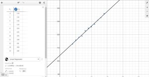
The least squares regression equation is:
![]()
Using technology, the correlation coefficient was calculated to be 0.9965, suggesting a very strong increasing linear trend. The coefficient of determination was calculated to be 0.9931 suggesting that 99.31% of the variability in gas consumption can be reduced by the regression with year.
We can also say that for each year that goes by, the gas consumption increases by 2.20909 billions of gallons on average.
Using this to predict consumption in 2008, where ![]() :
:
![]()
The model predicts 144.245 billion gallons of gasoline consumption in 2008. We have extrapolated somewhat and this model would be terrible at predicting the gasoline consumption in 2020, but we know that for a few years ahead, it is usually accurate.
 Notice that I kept the slope and intercept of my regression equation to several decimal places. This is to avoid errors in predicting. When multiplying x by the slope, it’s important to have several decimal places to avoid compounding the errors,.
Also, note that these relationships are simply correlations and it’s important to note that correlation does not imply causation. I can prove that shark attacks on the east coast of the US are highly correlated with ice cream sales, but we would not say that ice cream is attracting sharks. Just like the crickets chirps are not changing the temperature.
Try It Now #2
Try It Now Answers
- 54 degrees F
- 150.873, extrapolation
Media Attributions
- Figure 1
- Figure 2
- Figure 3
- Figure 4
- Figure 5
- desmos regression symbol
- Figure 6
- Figure 7
- FIgure 8
- Figure 9
- Figure 10
- warningsign

