
Visual Rhetoric and Document Design
We live in a visual world where every person with access to a computer has all the necessary tools to produce a quality product; our audiences expect quality work and we must meet their expectations. John McWade, author of Before and After Page Design adds, “Design has always been important, but the computer has put it center stage. It’s no longer enough to have a good product; it must be a good looking product” (Before and After Page Design). He continues, “The computer has made designers of all of us.” So, how can you embrace your new designer role?
Rebecca Hagen and Kim Golombisky, authors of White Space is Not Your Enemy: A Beginners Guide to Communicating Visually Through Graphic, Web, and Multimedia Design write,
“Visual Culture is a language, and like any language, visual culture has rules that make communication possible” (p. 2).
In our visually dense world, your document’s appearance–its design and visual impact–matters, even in academic writing.
PARC design principles
Proximity (Grouping)
Items relating to each other should be grouped close together. When several items are in close proximity to each other, they become one visual unit rather than several separate units. This helps organize information, reduces clutter, and gives the reader a clear structure.
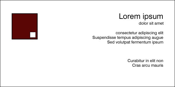
figure 1: source name creative commons generator pixabay who is the uploader site url
Alignment
Nothing should be placed on the page arbitrarily. Every element should have some visual connection with another element on the page. This creates a clean, sophisticated, fresh look.
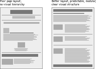
Repetition (Consistency)
Repeat visual elements of the design throughout the piece. You can repeat colors, shapes, textures, spatial relationships, line thicknesses, fonts, sizes, graphic concepts, etc. This develops the organization and strengthens the unity.
Contrast
The idea behind contrast is to avoid elements on a page that are merely similar. If the elements (type, color, size, line thickness, shape, space, etc.) are not the same, then make them very different. Contrast is often the most important visual attraction on a page–it’s what makes the reader look at a page in the first place.
William’s jokingly claims that designers who don’t effectively use these PARC design principles get CRAP (PARC spelled backwards). John McWade adds, “Designed correctly, the paper does not appear to be designed at all; what the reader perceives is power and presence. Poor design is like smog. You can see air only when it’s dirty. When it’s clean it’s invisible and you see the fantastic mountains, unaware of the air at all” (Before and After Page Design).
Writers must develop document design skills as 21st Century rhetorical communicators.
Presentation Guru, Garr Reynolds expands on these concepts.
Additional Page Design tips
- Use the right paper and ink.
- Use consistent page numbers, headers, and footers.
- Use ample and appropriate margins (Leave a one-inch margin around the page).
- Use ragged rather than justified right margins.
- Use list format for easy reading.
- Keep reasonable line length.
- Keep consistent line spacing.
- Use adequate white space to balance the density of print and make the page inviting. (In document design, negative space is often referred to as white space).
- Use white space consistently to show organization and hierarchy of ideas.
- Set off headings with white space.
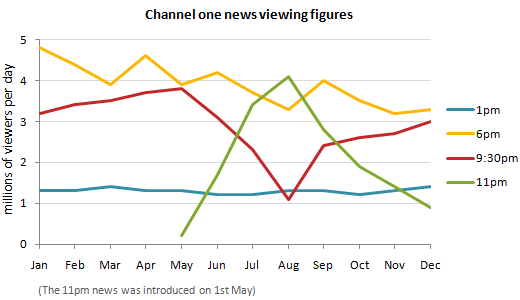
Tables and Figures

-
Help us better understand data
-
Compare data from the same time period
-
Represent specific facts visually
-
Interpret why something occurred or is occurring
-
Make predictions about events that happened
-
Shows how parts are compared to one another
Types of Graphics


How to use visuals
-
Every image should serve a specific function (graphics provide information—not decoration).
-
Always introduce and explain visuals.
-
Caption every visual.
-
Include copyright and permission information.
-
Proofread all visual information.
-
Leave enough white space around the image.
Tips for reading Visuals
-
Read the title or heading of the visual first. This will indicate the topic of the graphic or the type of information presented.
-
Read all the labels on the visual. The labels tell you what each line, mark, or section on the graphic represents.
-
Read any other text that has been written on or around the graphic. Writers often provide short explanations for the different parts of the graphic.
Adapted from “Design.” Authored by: Jill Larsen. Located at: https://edtechbooks.org/writing/design
License: CC BY-SA
APA Citation
Larsen, J. (2020). Design. In C.C. Charles (ed.), Writing in the Social Sciences. Edtech Books. https://edtechbooks.org/writing/design
